ABOUT

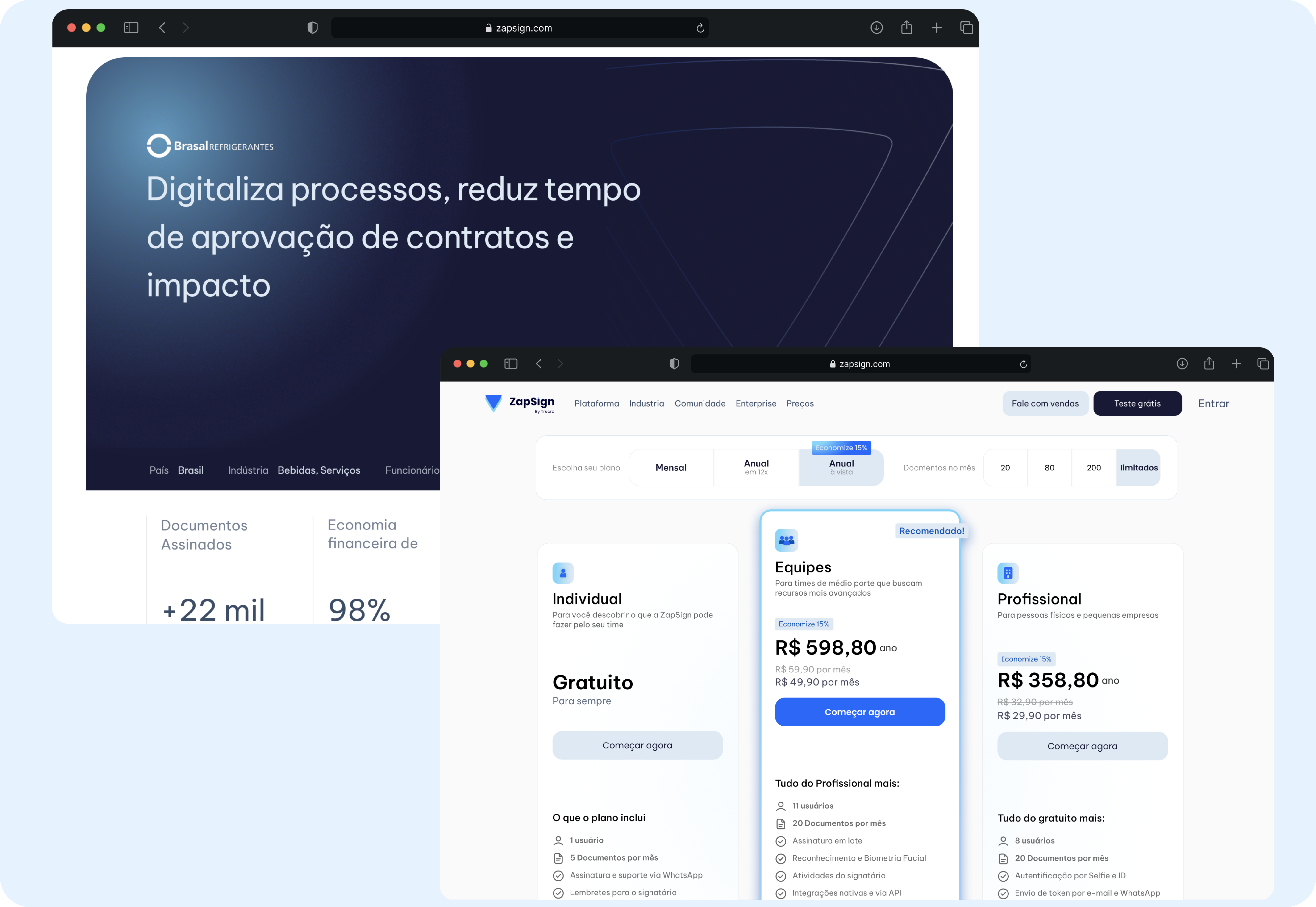
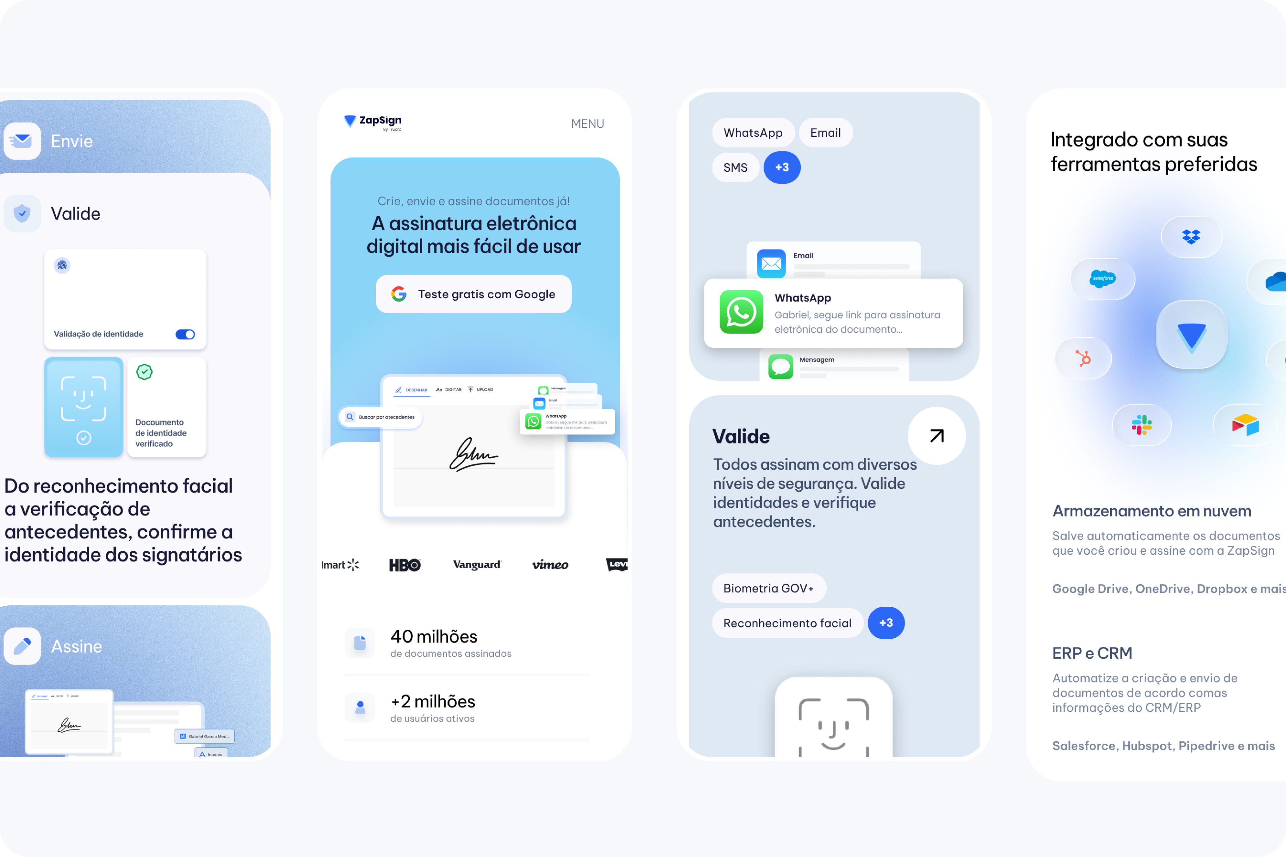
With over 5 million users across 81 countries, ZapSign is a global SaaS leader in electronic signatures, serving a wide spectrum of clients from individual users to large enterprises.

CHALLENGE

ZapSign was undergoing a global rebranding process and needed a powerful new website interface to stand out from regional competitors and position them alongside major global players like DocuSign. The challenge was to push the boundaries of their new brandbook in the digital environment, proposing visual alternatives that conveyed institutional trust and modernity.

BRAND

I led the end-to-end visual direction: from typographic curation to designing visual assets that materialized the product's features and international security certifications. In collaboration with the ZapSign team, we had to strike a delicate balance: projecting the robustness expected by Enterprise clients while maintaining an approachable and welcoming visual language for small businesses and individual users.

Be Vietnam Pro

ZapSign aims to be human and deeply connected to the end-user's real-world environment. To achieve this, I art-directed a series of AI-generated digital photographs and videos. These assets maintain a cohesive atmosphere—carefully standardizing lighting and wardrobe color palettes—to highlight a diverse range of people and businesses. The visual narrative focuses on users interacting with document creation: a task that is traditionally heavy and tedious, but feels light, seamless, and efficient with ZapSign.
The crafting of the product feature illustrations was also included in. We faced a unique challenge here: because ZapSign's core digital product was simultaneously undergoing a visual redesign, we lacked enough finalized UI screens to accurately reflect the platform's future state. To solve this, we opted for a conceptual, minimalistic approach. I represented user actions and platform flows through abstract UI illustrations, communicating the regular user journey and product resources without polluting the website with too dense dashboards.

SOLUTION

The homepage was designed to showcase the product's features through a bold visual language, brought to life by subtle micro-interactions. A primary focus of this page was to strategically surface key data points and metrics, serving as strong trust signals to reinforce the company's reliability and institutional credibility.
With a strong focus on conversion, the proposal included at least two variations for the homepage's hero and feature showcase sections. One variant was bold and serious, tailored to resonate with Enterprise clients, while the other took a lighter, more approachable tone. This strategy provided ZapSign with a versatile design toolkit to communicate their brand across different target audiences and A/B test the results live in production.
The project scope extended across the website, including Feature detail pages, Pricing, and the Blog. For the Feature and Blog sections, I designed scalable, standardized templates to ensure visual consistency and ease of maintenance. The Pricing page, being a critical conversion touchpoint, was approached differently: I delivered multiple design variations to enable further performance testing and optimization.
The visual strategy focused on integrating subtle micro-interactions throughout the entire user journey, making the website reactive to mouse movements. Even the 404 page, a typical friction point, was turned into a moment of delight by allowing users to play with a functional digital signature simulation.
The mobile experience was crafted with the same pixel-perfect attention to detail as the desktop version. I focused heavily on motion design, ensuring that the fluid animations applied to cards and the immersive navigation menus translated seamlessly to smaller screens.

OTHER CASES

FACILY
PERUSSI®