PERUSSI®

Facily

ABOUT

Facily, the first social commerce platform in Latin America, was experiencing hypergrowth and needed to improve its product page experience.

CHALLENGE

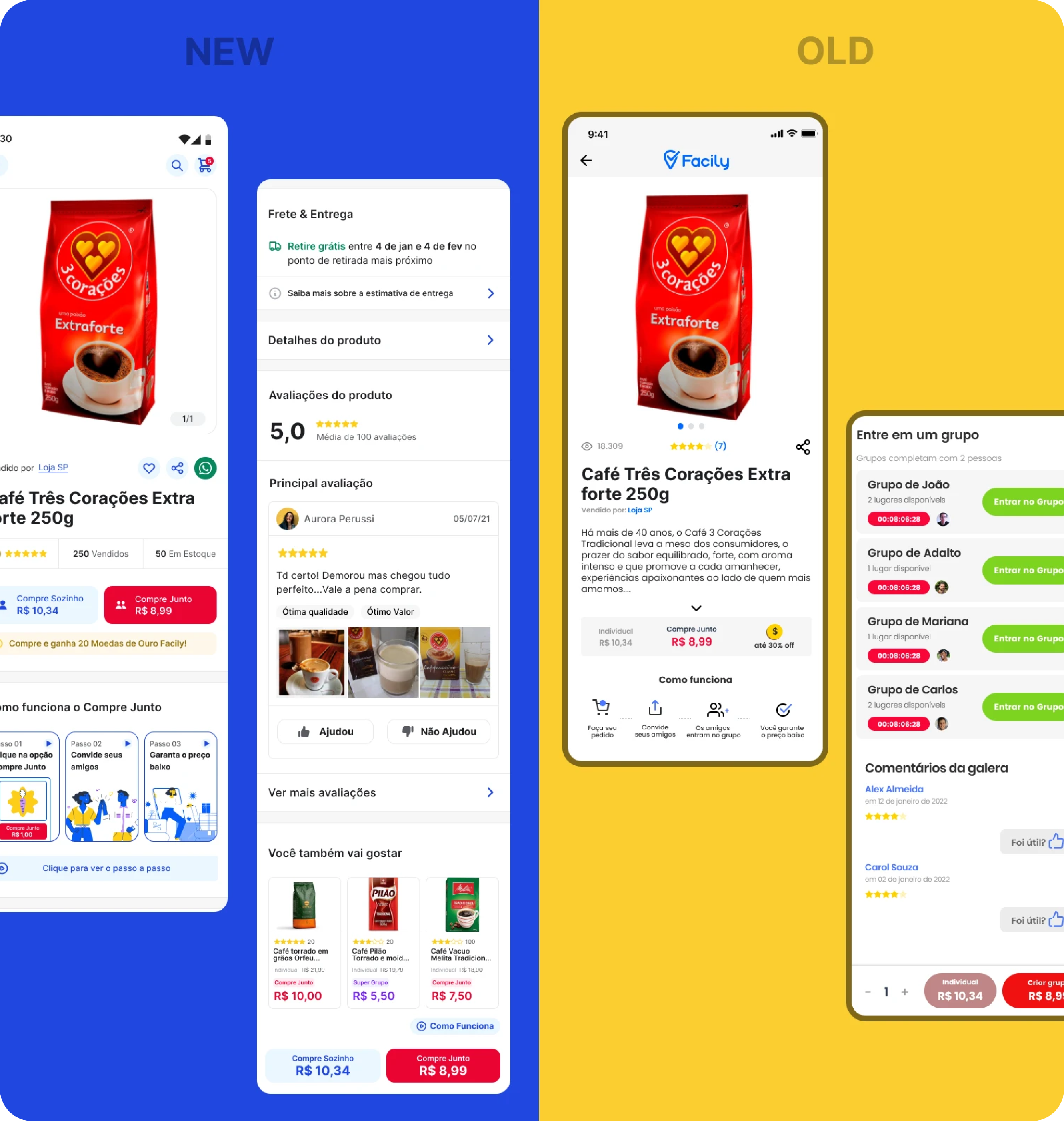
The challenge was to understand whether a redesign was necessary and how to make the purchase journey clearer for users, especially because many struggled to understand the group-buying model.
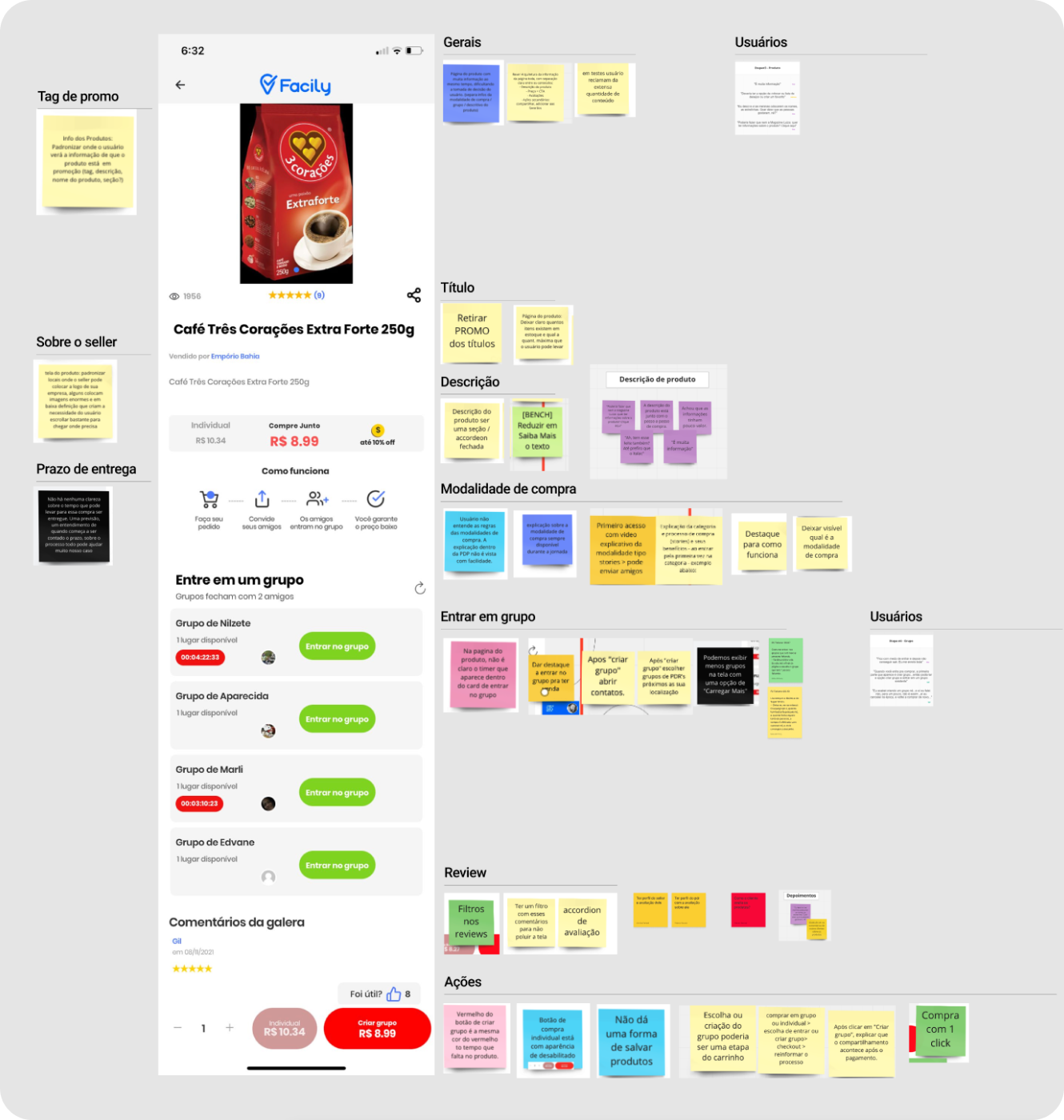
Once we had the stakeholders' point of view, I divided the screen into 9 parts and conducted an exhaustive benchmark study with more than 15 direct and indirect competitors, as well as consulting case studies from the Baymard Institute. The focus of the research was to find the most common elements and their respective order in each part of the product page. This study generated a presentation for the various stakeholders with opportunities in features, content, and information architecture for each piece of the page that would be prioritized by a prioritization matrix, putting all the essential features in the must have quadrant.
SOLUTION

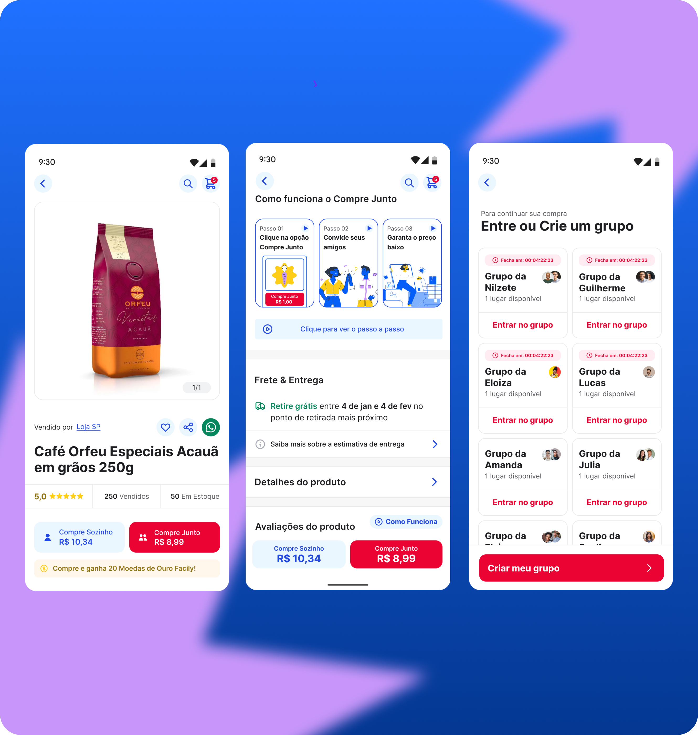
To solve this, the redesign focused on simplifying the purchase flow and improving user education throughout the experience.
To amplify possibilities and get feedback in the earlier stages, we ran a 60-minute design critique workshop where designers could analyze each section of the page. After the first round, I took one more round of discussion, closing our first proposal.
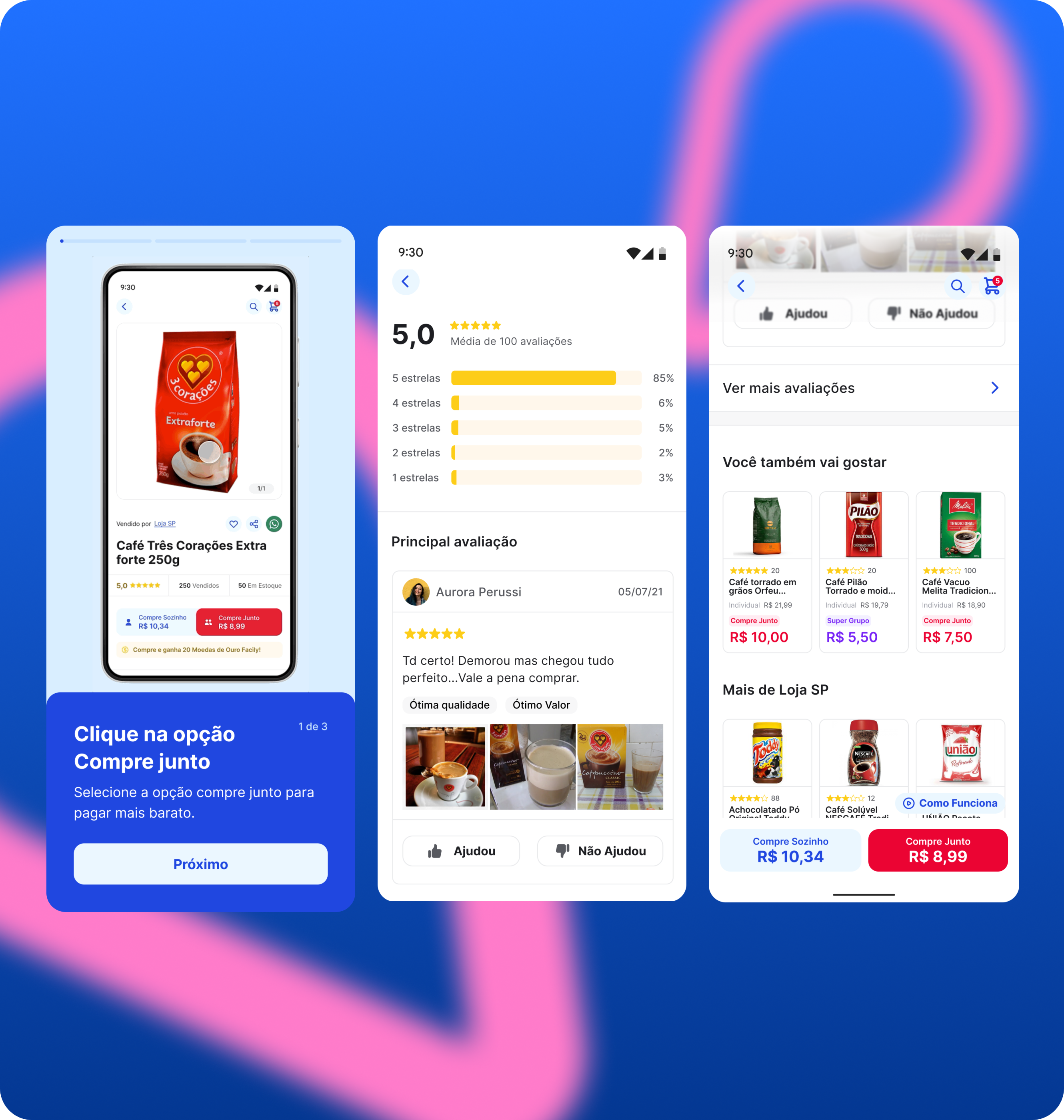
A tutorial format inspired by stories was introduced to help users understand how Facily's group-buying system worked, while the product page architecture was reorganized to reduce distractions and guide users step-by-step.

RESULTS

The proposed changes were validated through unmoderated and moderated usability tests with more than 400 users. The results showed a 21 points improvement in usability score.

OTHER CASES

PERUSSI®